Design study
Watermark Concepts
Six ways to mark the artwork images — from barely-there signatures to full protective tiling. Same painting shown in every example so the treatments can be compared directly.
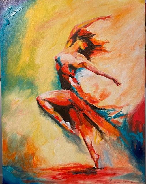
Concept 01
Corner Signature
A small typographic signature in the lower-right. The most discreet option — reads as part of the presentation rather than a stamp.
Concept 02
Centered Ghost Wordmark
Large, very low-opacity name across the centre. Hard to crop out, still easy to see the painting through it.
Concept 03
Diagonal Tiled Pattern
Repeating name across the whole image at very low opacity. Strongest protection against reuse — best for high-resolution files.
Concept 04
Caption Strip
A soft gradient bar along the bottom holding the name and site. Doubles as a credit line when the image is shared on social.

Concept 05
Logo Mark
The existing logo, knocked out in white at low opacity in a corner. Keeps the site branding consistent across every image.
Concept 06
Etched Monogram
A large 'GW' monogram in the corner, outlined rather than filled — like a glass etching. Subtle but distinctly his.
These are previews rendered over the image on the website. Once a direction is chosen, the same mark can be baked into the exported image files so it travels with the artwork wherever it's shared.